PASHA Bank Annual report
PASHA Bank Annual Report

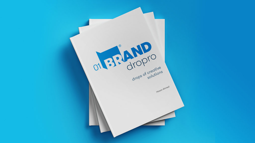
BRAND DROPRO BRANDING, BOOK LAYOUT DESIGN AND AUTHORING
This book aims to highlight exceptional and varied experiences, like a beautiful visual cocktail, to raise the level of thoughts before the vision for everyone who sees it.
The work presented in this book is characterized by its wide variety in covering different sectors. It intends to serve as a reference for rumination and construing. There is a station in each example that is worth waiting for and benefiting from, in the display, the use and possibility of expanding in it.
The works were carefully selected and the book was classified as a smooth and beautiful journey for the reader. For the book to be a reference for inspiration, it is not limited to the display of identities, but their applications so that it come to be a source that generates many ideas.
A book that is considered a quality addition in the world of unique visual designs.
Author by Hasan Ahmed
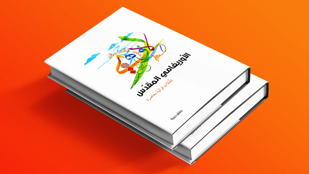
HOLY ORIGAMI BOOK
It’s an initiative of its first kind, that present a different understanding if some of versus of Qur’an and highlight the principles of Marketing, Political and Social in our daily life.
The book direction depend on Arabic Calligraphy with colorful look and feel, plus using the info graphic art.
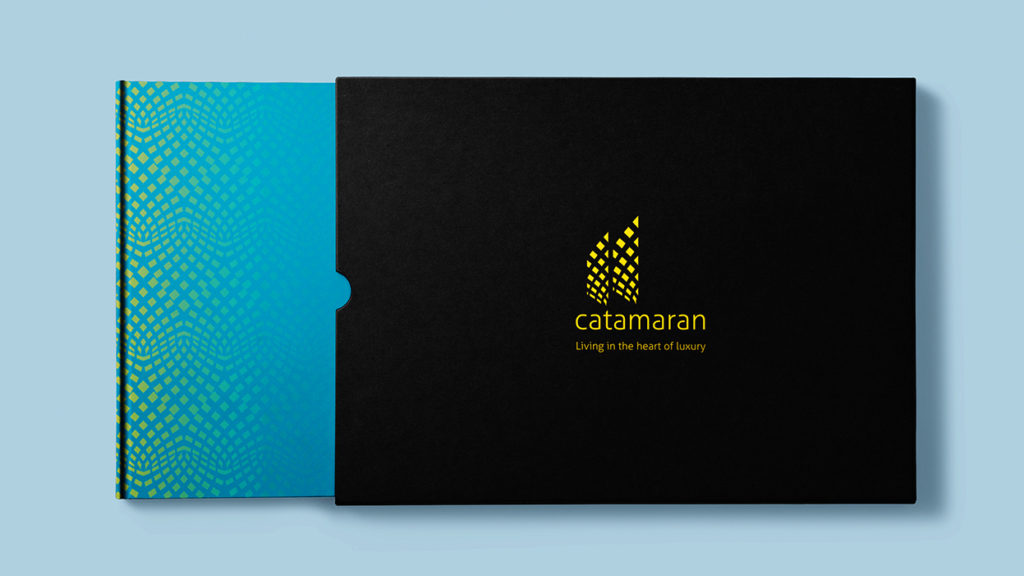
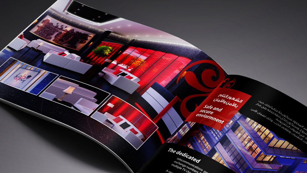
CATAMARAN BROCHURE
Twin Towers in the heart of Manama, an architectural design that blends elegance and romance. Through its unique architecture, the developer of the these tow towers wanted to have a modern, luxury and unique brochure design.
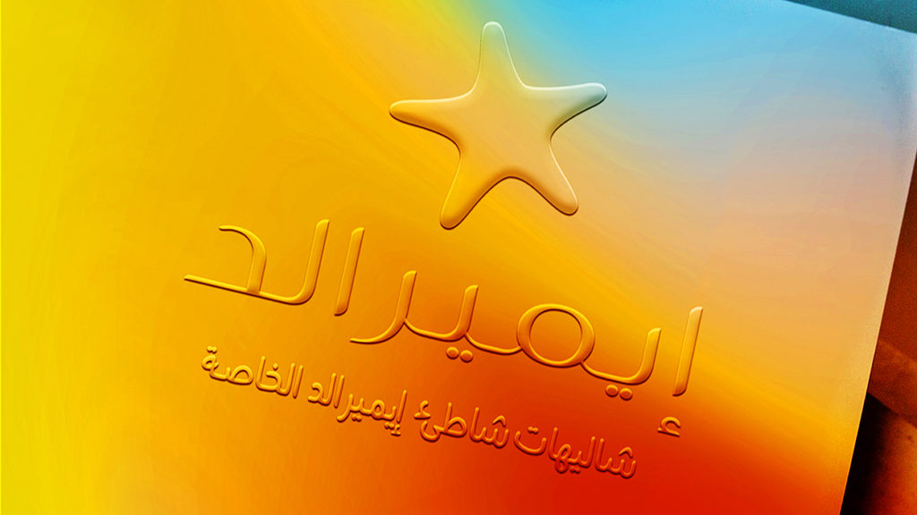
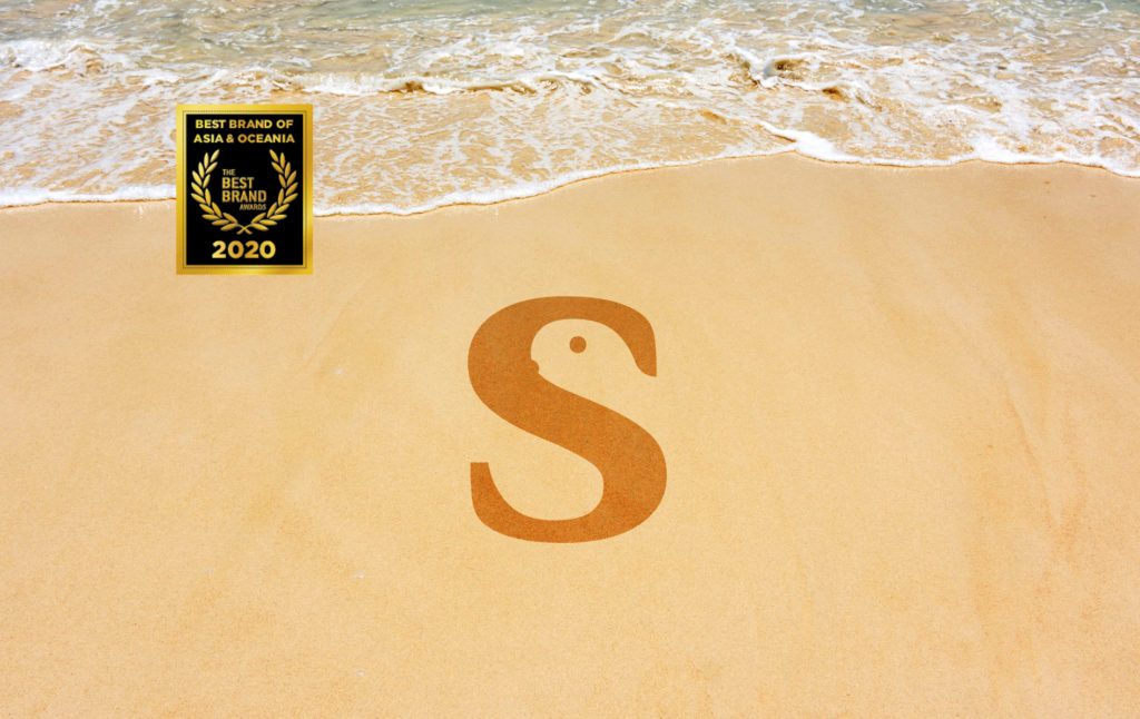
EMERALD REBRANDING & BROCHURE Emerald as a shining sea star in sunrise on the shore of the Red Sea, the brand identity is designed for the creative real estate company in real estate solutions.Emerald is a beach chalet group that caters to the needs of business and wealthy families white maintaining privacy and luxury. share …
DELMAR BROCHURE Delmar Brochure Reflect Design Layout, by Using Colors in Harmony and Using a Unique Patterns That Present The Look and Feel for The Brand. The Design Take You Through The Beauty of The Job in Smooth and in Eye Catchy Way, Where Can Reader Feel The Synergy Between All Elements Included, and Leave …
Tortoise Beauty
A leading provider of cosmetics for women, made from the bounties of nature from both land and sea, the company wanted an iconic identity that matches the name of tortoise, as an amphibious animal that symbolizes calmness and relaxation in a world full of noise and speed detrimental to the health of the spirit, mind and body!
The company suggested that its identity should be a “typography negative space” because of the intelligence and elegance that it entails, which is what the company is looking for, and that it has global specifications because its future market is the whole world.
The company also requested a “corporate pattern” inspired by land and sea plants that was specifically created to highlight its style and personality.