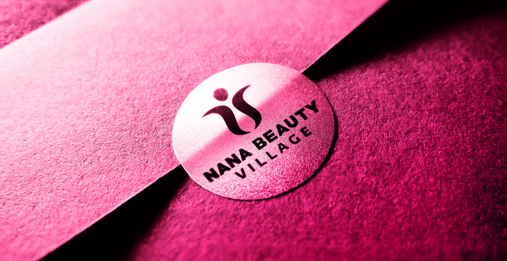
The brand
Nana Beauty Village is a feminine, elegant and caring cosmetic brand with a mission to pamper women of all ages and backgrounds.
The task
To create a visual identity that reflects brand essence and values in an iconic mind imprint.
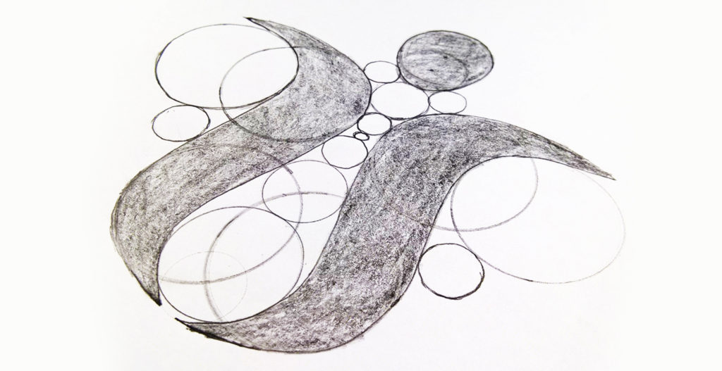
Process
The logo is an expression of universal feminine natural beauty. An open for life shape that creates both a strong and loving figurative female presence.
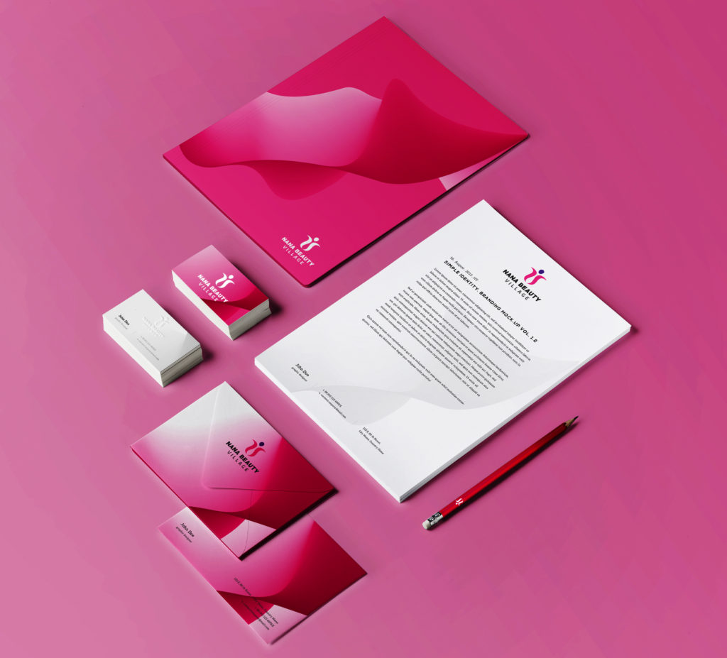
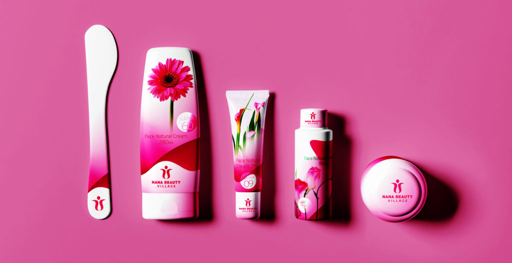
Colors
The logo contains 4 colors, black and grey to symbolize elegance and respect, pink that stands for feminine grace and violet on top to signal spirituality.
Other
Created a special element of color patterns to compliment the brand’s feeling and strengthen its presence.